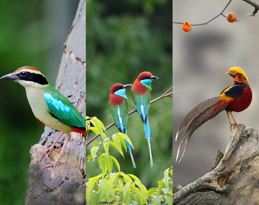
This season’s theme, "Elegant Exploration", suggests that although the bustling city, with its steel and concrete, is vibrant, it can easily trap our minds and bodies. We strive to find balance between urban life and nature — helping those accustomed to city life easily transition to a new rhythm, breathe freely in the mountains and wilderness, and feel the whispers of sunlight, wind, and plants. Exploring nature spontaneously, we measure the unknown with our footsteps and write our chapters of freedom.
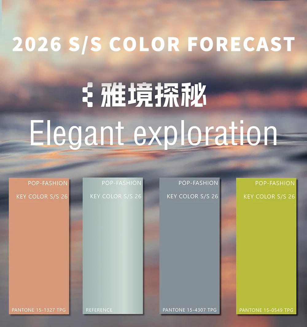
Key Colors for Spring/Summer 2026
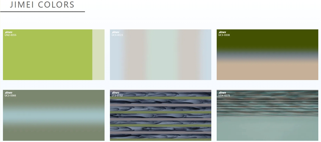
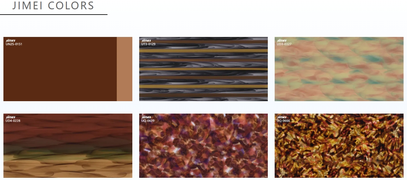
Tradewinds

Inspired by the fleeting moment when a trade wind brushes across the ocean, Trade Wind Gray blends blue and gray tones, capturing the subtlest transformations in nature. This color is rich in depth and meaning, radiating stability and warmth. It is highly versatile in outdoor styling, complementing other colors and elements to create clear visual hierarchies.
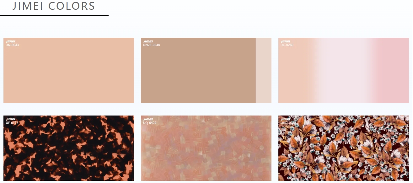
Key Colors for Spring/Summer 2026
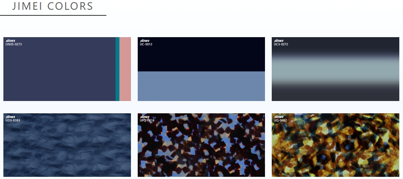
Peach Bloom
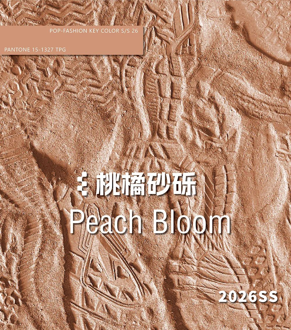
Drawing its inspiration from blooming peach blossoms in spring, Apricot Sand is a delicate, vibrant hue that exudes warmth under the sun. Merging shades of pink and soft orange, this unique color flawlessly combines the beauty of nature with outdoor fashion, offering adventurers a new choice that embodies elegance and the essence of the natural world.
Thematic Stories
【Perception】
In this small journey titled "Perception", outdoor style is not merely a lifestyle but also a reflection of understanding and respect for nature. Living among mountains, rivers, and lakes, we follow the rhythm of nature, feeling its vitality and energy. It allows us to enjoy the convenience of city life while easily embracing summer adventures, letting our souls unwind in nature to discover pure freedom and joy.
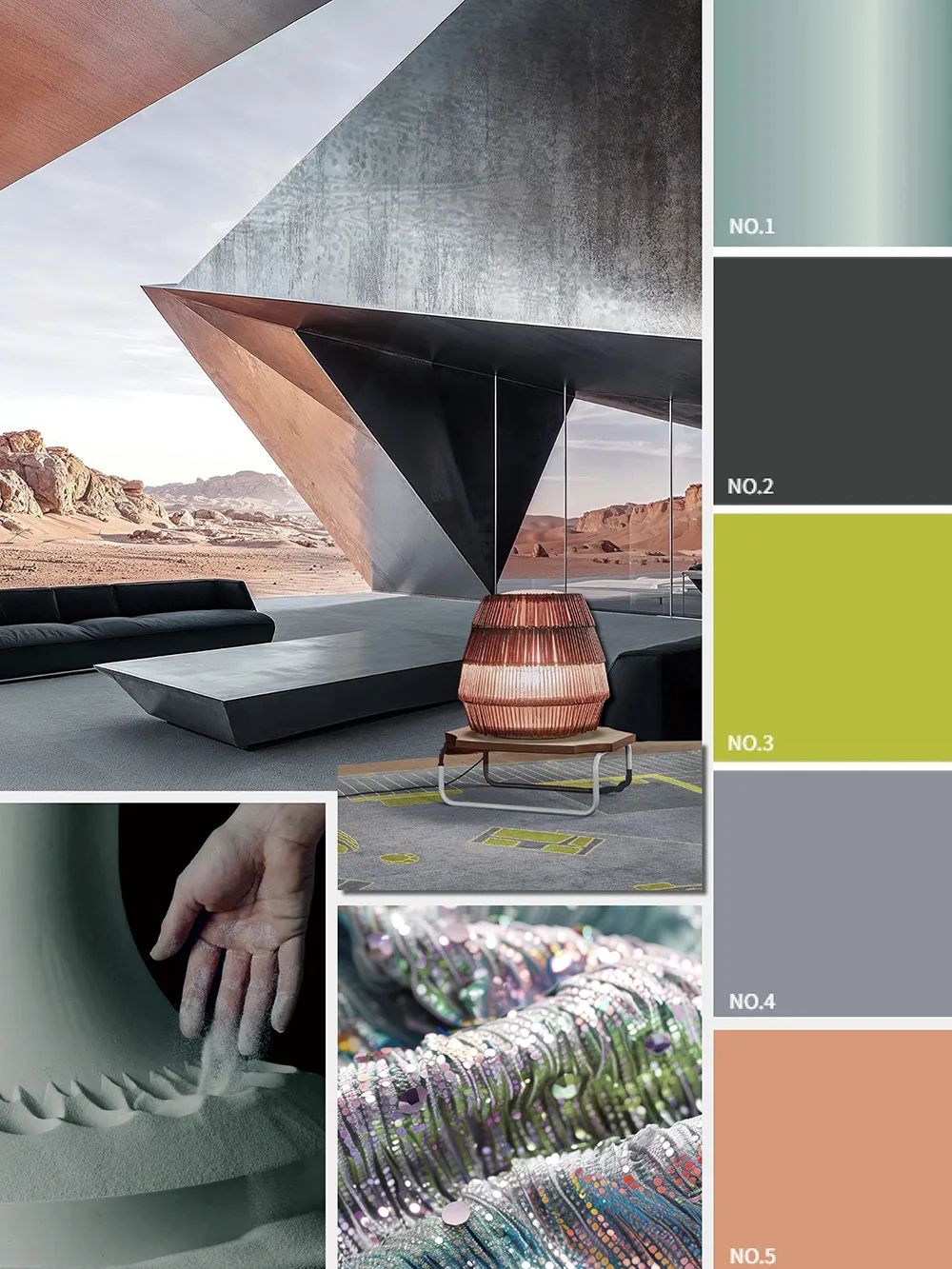
【Balance】
Nature and humanity coexist in harmony, with the changing seasons and flowing rivers helping to maintain ecological balance. We walk through nature, measuring the mountains and rivers with our footsteps and capturing beauty through our lenses, continuing to write the most beautiful chapters of the relationship between human exploration and nature's preservation.
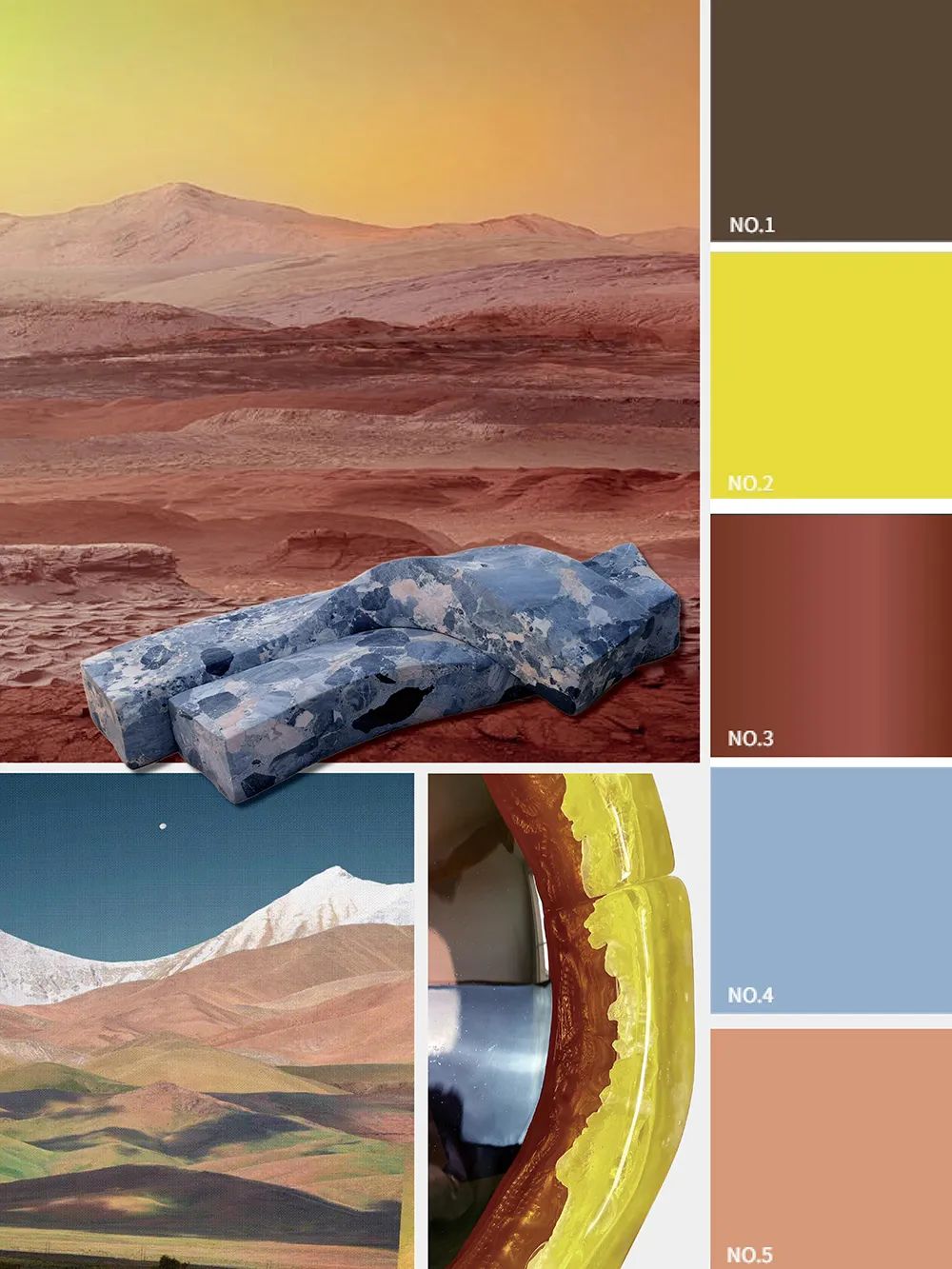
【Cycle】
Smooth strokes illustrate the rhythm of nature, sensing the mysterious energy that cycles through land and clouds. As all things grow and wither, this energy gently oscillates across tranquil landscapes, becoming the cradle of life. As we relax our minds and bodies, we feel the beauty of nature and realize that whether it’s the sunlight of dawn or the starry sky at night, each is a silent expression of nature’s energy.
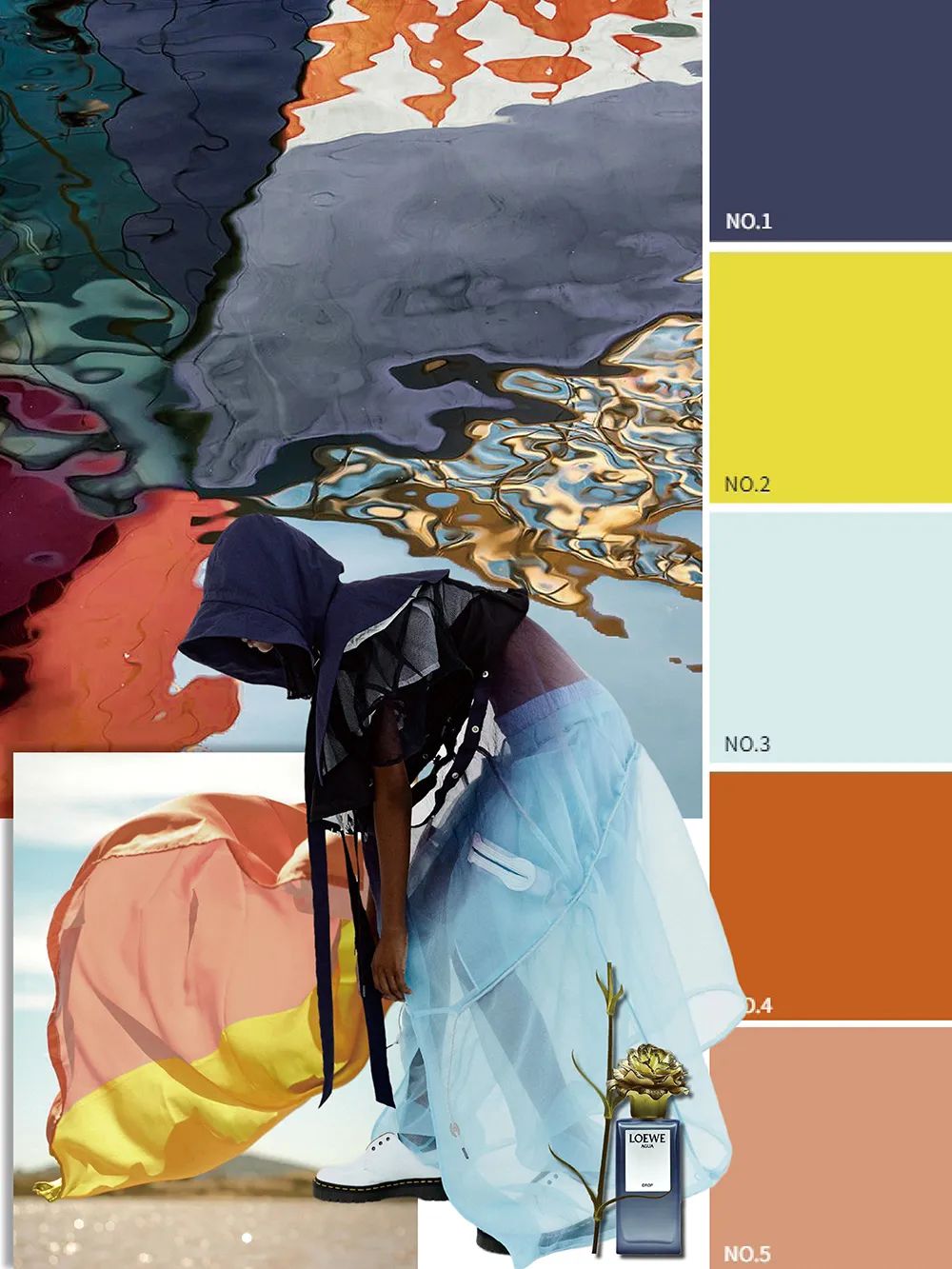
Spring/Summer 2026 Color Palette
The color palette for Spring/Summer 2026 reflects people’s curiosity and exploration of nature, combining subdued cool tones with vibrant warm hues to convey a relaxed and joyful lifestyle. The deep blue-gray tones set an elegant foundation for the outdoors, while the gentle apricot tones add a touch of softness and poetic expression. The use of metallic elements brings innovation to the visuals, accented with yellow-green hues to evoke anticipation and excitement for outdoor adventures, driving the popularity of spontaneous exploratory lifestyles.