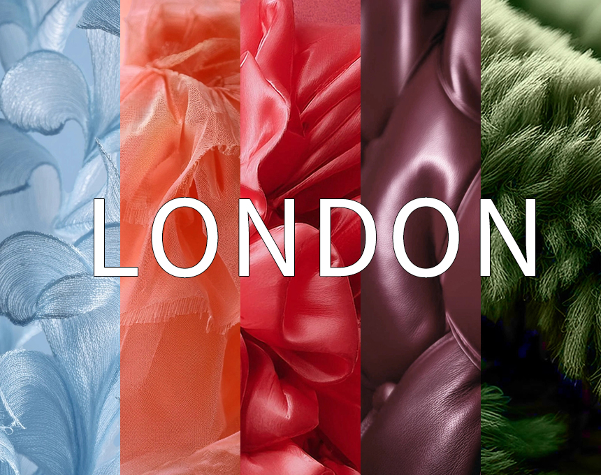
As we approach the pivotal year of 2026, when old notions are challenged, opportunities abound, creativity drives progress, and transformation is imminent. In terms of color, polarization is at the heart of the selection, ranging from opposing colors on the color wheel to the feelings each hue evokes. This season focuses on opportunity, hope, and unity.

The WGSN FW 2026/27 key colors reflect this: vibrant brights, grounded darks, and soft neutrals. They embody the desire for balance, excitement, and stability.
Driven by the "colorless" trend, consumers are increasingly favoring more enduring colors, making darks still very important. Evening Transformative Teal continues to hold a significant position due to its cross-seasonal appeal. Still, WGSN favors Prism Darks, seeking colors that particularly shine when paired with darks, such as Green Glow.
Rebellious attitudes continue to influence this season's brights, but the demand for color has transcended the style, with Fresh Purple emerging as a representative of unity and harmony. In contrast, the need for recovery has driven the development of healing tones, with Wax Paper helping to balance seasonal brights.
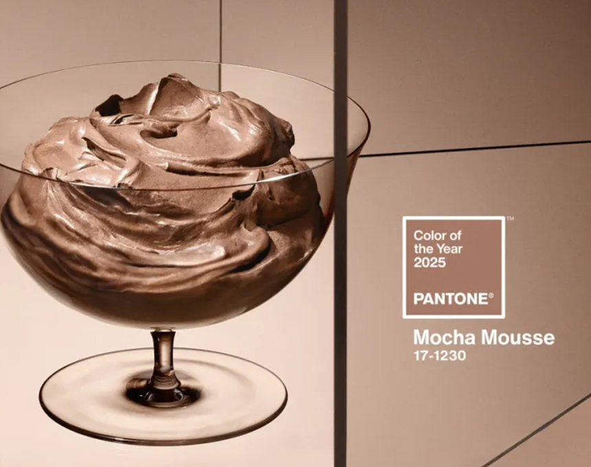
The fusion of the past and present highlights the importance of Cocoa Powder. Through AI creativity, we see a new vision from historical periods ranging from the Renaissance to indigenous cultural knowledge, all of which champion traditional techniques, craftsmanship, and color.
Key Colors for FW 2026/27
Please explore the new key colors of WGSN FW 2026/27. The following five colors will set the tone for the season and have a certain impact on the color application of celluloid sheets.
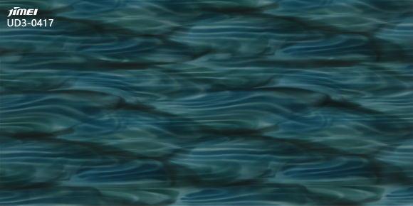
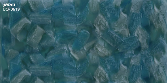
Transformative Teal
PANTONE 19-4517 TCX
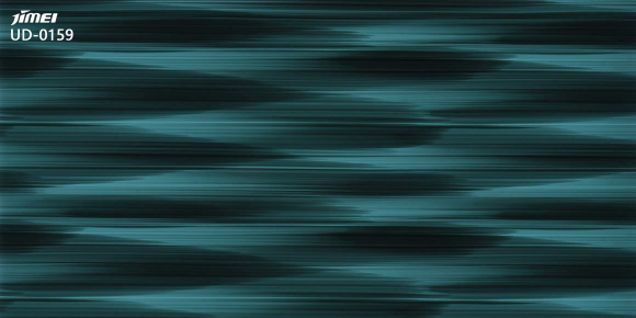
Transformative Teal lies between blue and green, a color that is both awe-inspiring and captivating, highlighting the importance of the "Earth First" philosophy. This season, WGSN focuses on the connection between the digital and the earth, nature, and post-nature, pushing this hue towards a new world that practices earth-friendliness.
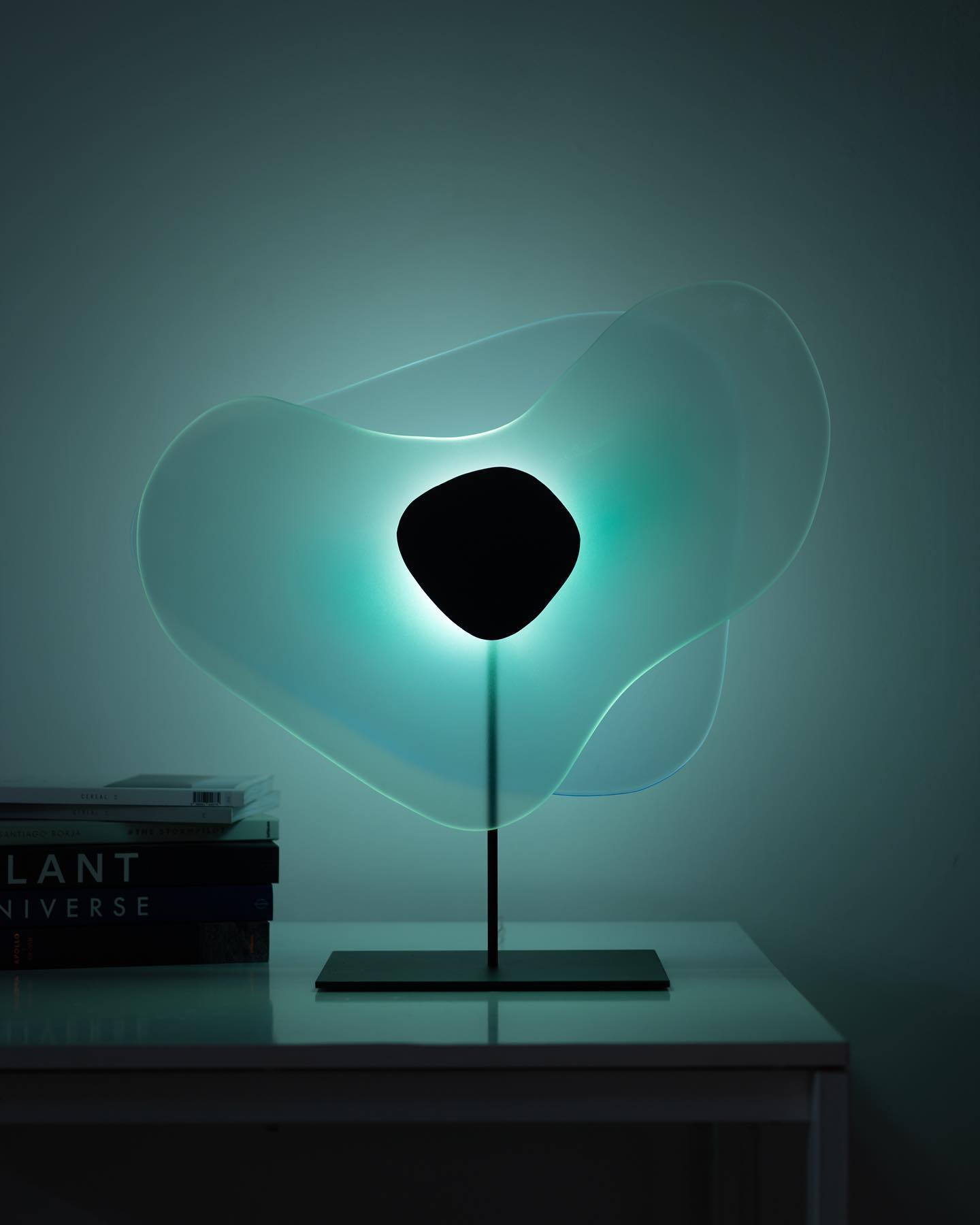
For the Acetate cellulose sheet, the mysterious and charming effect can be used to present Transformative Teal. For example, using neon effects, wood grain effects, and so on.

Wax Paper
PANTONE 12-0806 TCX
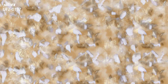
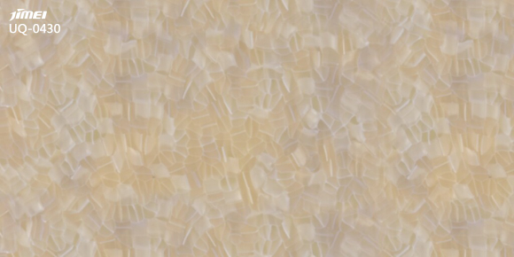
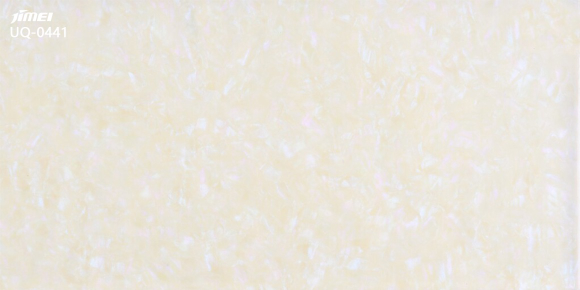
Wax Paper is a cream-toned, slightly yellowed off-white, a calm and almost neutral hue with a soothing and tranquil characteristic. This tone gives a warm feeling, reminiscent of inner light, the gentle winter sun, and the sensation of basking in sunlight.

Wax Paper's simple and elegant temperament, when applied to Acetate cellulose sheet, can highlight minimalist themes, drawing attention to premium neutrals.

Fresh Purple
PANTONE 19-3536 TCX
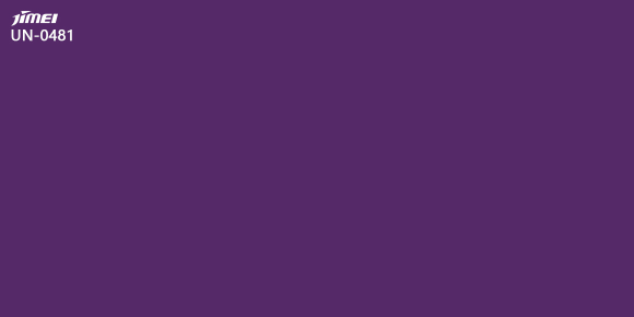
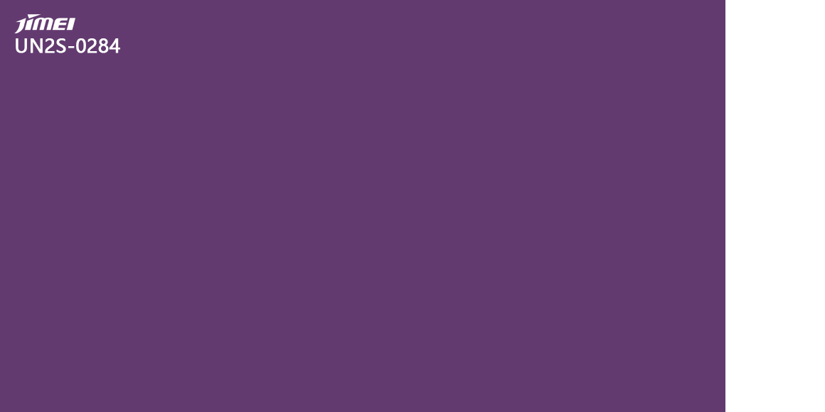
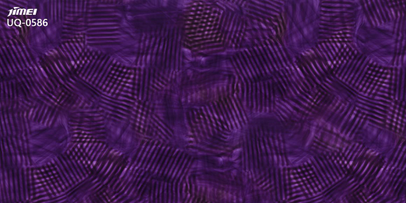
Fresh Purple is a color-rich in cultural emotions, closely related to royalty, love, mystery, and spirituality. This hue subverts our traditional perception of it and examines it from a new perspective. Fresh Purple is a love-hate color, like a journey, a fusion of red and blue, symbolizing harmony and unity.

Fresh Purple is a vibrant and youthful color, applied to an Acetate cellulose sheet, which can serve as an accent color or a personality solid color.
Cocoa Powder
PANTONE 19-1620 TCX
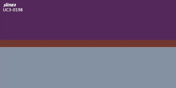
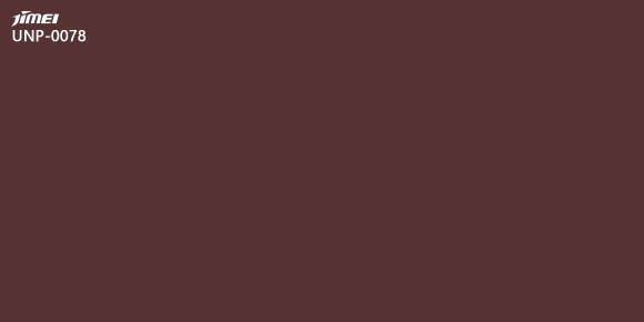
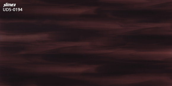
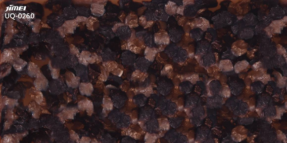
Cocoa Powder is a red-toned brown that evokes a sense of nostalgia. In the age of artificial intelligence, this color is inspired by a desire for the past and the real. Cocoa Powder has a soft feel, reminiscent of the passage of time and the pursuit of slowness. It is both rich and luxurious, yet familiar and common, heralding a "realistic revival" in the digital age pursuing AI technology.

As a new dark color with cross-seasonal appeal, Cocoa Powder applied to Acetate cellulose sheet, made into eyewear or accessories, can be flexibly matched with men's and women's clothing, as well as footwear.

Green Glow
PANTONE 13-0540 TCX
Green Glow is an emotionally rich and warmly bright color. It lies between yellow and green, and this color radiates light, reminiscent of neon and infrared lights. Its hypnotic quality can evoke a range of emotions, from unease to enthusiasm, injecting a sense of escape into everyday life.
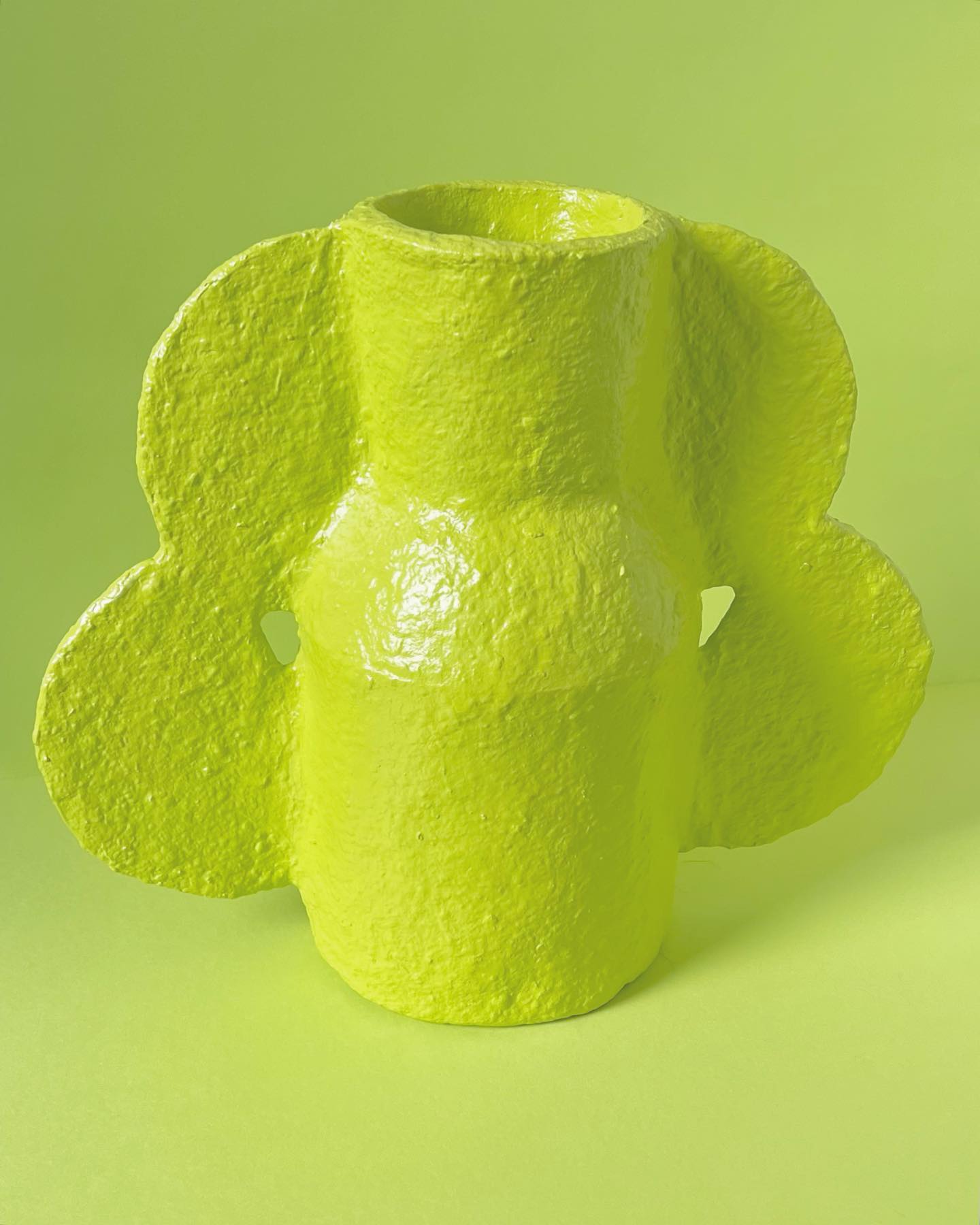
The vibrant Green Glow, when applied to the Acetate cellulose sheet, can serve as an accent or solid color, making it the perfect choice for all product categories.
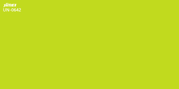
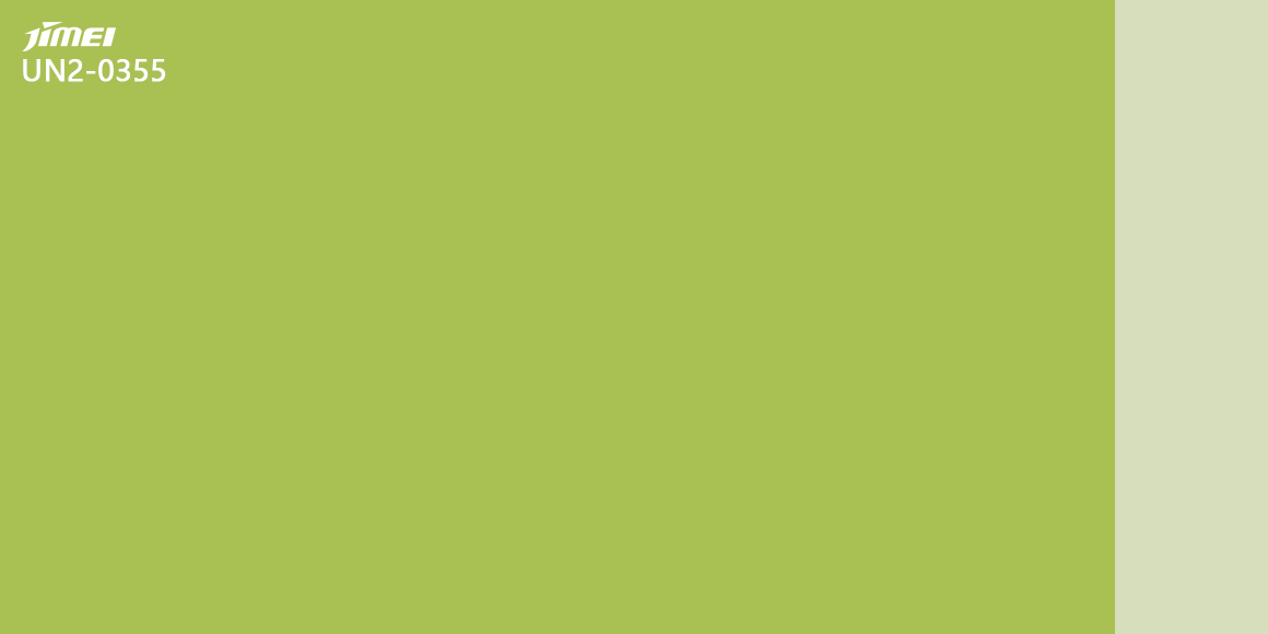

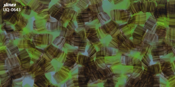
WGSN FW 2026/27 global key colors showcase a trend of color polarization, emphasizing balance, excitement, and stability. Transformative Teal
, Wax Paper, Fresh Purple, Cocoa Powder, and Green Glow are the five key colors of this season. These colors not only reflect people's pursuit of earth friendliness, simplicity, tranquility, cultural emotions, realistic revival, and passionate brightness but also inspire the color application of cellulose acetate adhesive sheets. They each have their characteristics, which can be presented independently or matched with each other, adding diverse charm to autumn and winter fashion.

